
Crafting a unified and consistent platform experience
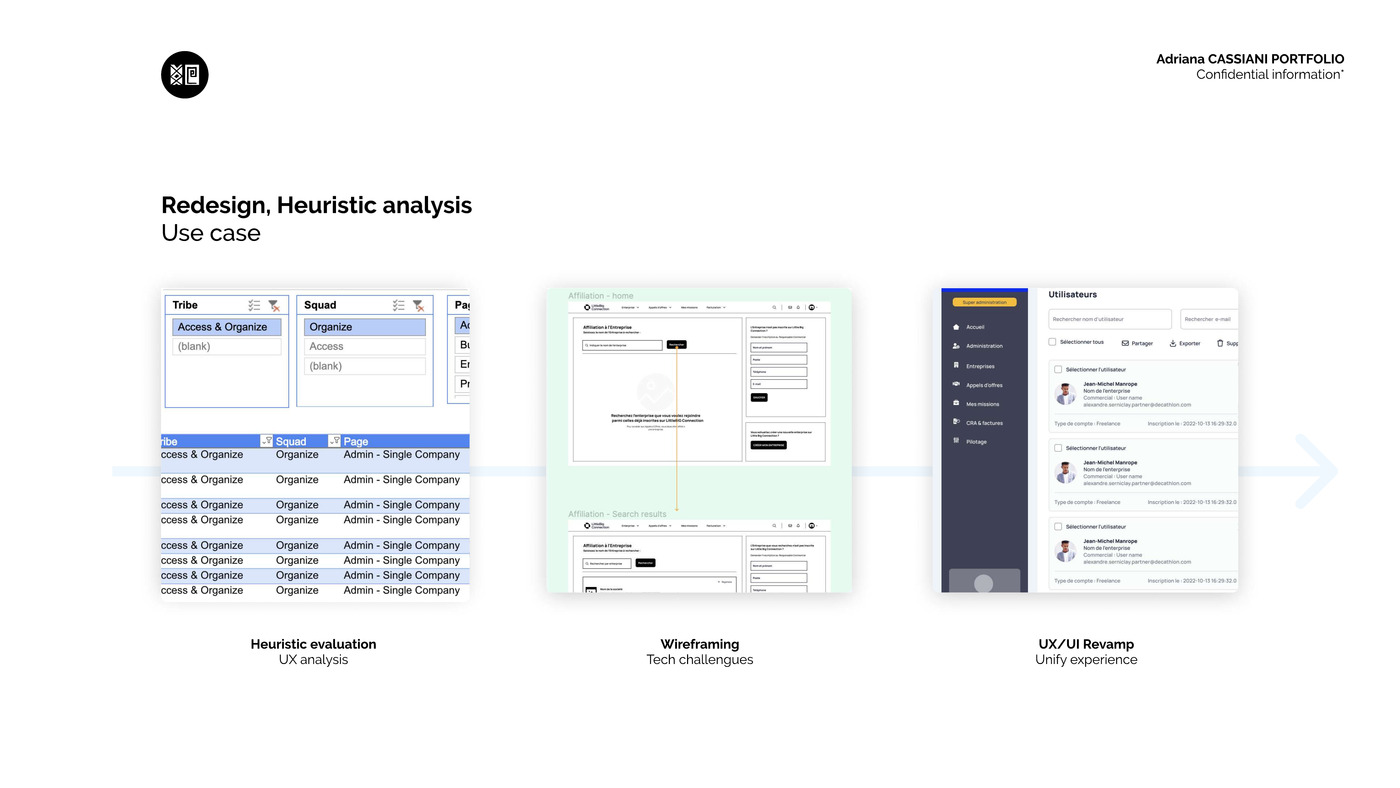
Get a complete picture of every screen in the product, classify it, and expose its usability debt before investing in a redesign.
470+ screens audited, a new information architecture, and a unified interface shipped to production.
Context
After years of feature-by-feature growth, LittleBig Connection had screens with no clear owner, inconsistent interaction patterns between modules, and cross-functional teams who couldn't say who was responsible for which part of the product.
This wasn't only a visual problem — it was a product governance problem. We needed to understand what existed before deciding what to change.
Approach
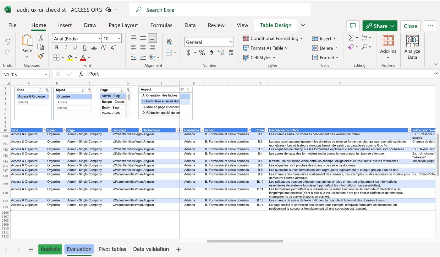
I designed an audit system based on Nielsen's usability heuristics, run through a centralized file documenting every screen by tribe, squad, and the severity of any issue found — from "no violations" to "usability catastrophe."
The audit, by the numbers
Each row went beyond a severity score — every aspect was tied to a written criterion, like "form fields contain default values" or "field labels clearly explain what input is expected," so any designer or PM could see exactly why a screen scored the way it did, not just that it did.
From findings to redesign
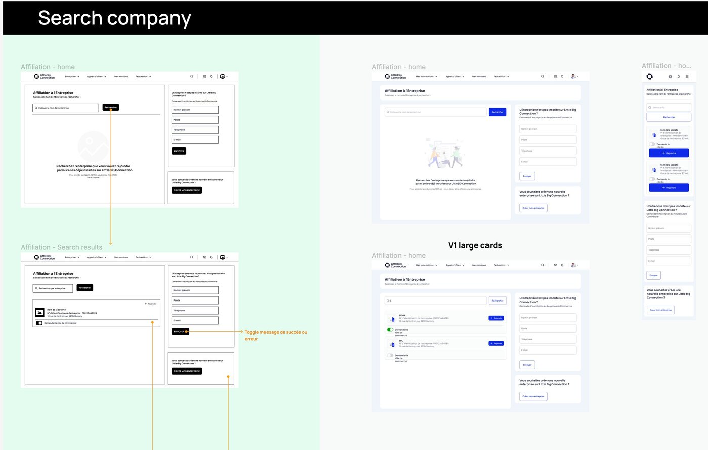
With friction points listed and categorized, I proposed new interfaces, built wireframes, and developed UI components aligned with the design system — working directly with engineering and QA to ship each screen to production without losing consistency.
Consistency across roles
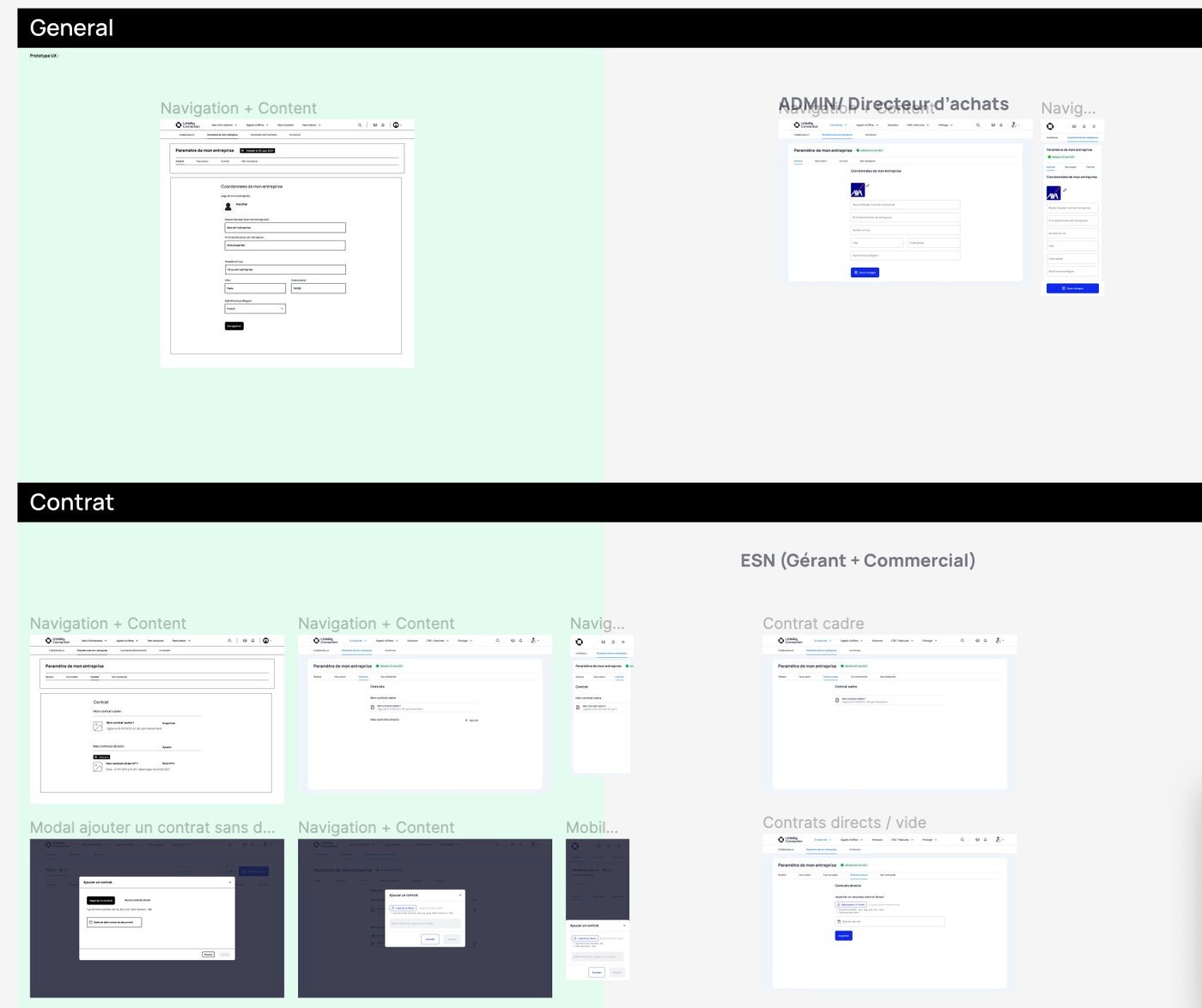
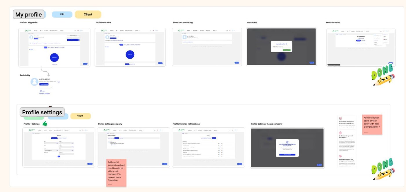
The platform served several roles at once — clients, ESN companies, freelancers — and each one saw a slightly different version of the same screen. Part of the audit was checking whether "Admin / Directeur d'achats" and "ESN (Gérant + Commercial)" views of the same settings page stayed visually and functionally consistent, or quietly drifted apart over time.
Profile and account settings
Smaller screens carried real friction too. Account closure had no explanation of what happens next, which the audit flagged directly: "add information about conditions to be able to quit company, to prevent user frustration." Privacy settings had the same gap — reviewers asked for the kind of plain-language explanation Airbnb gives before someone changes a data setting.
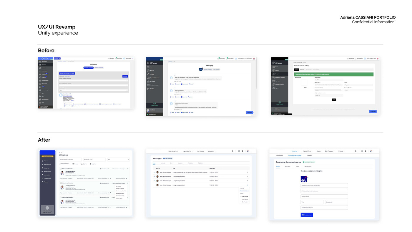
Before / after
The revamp unified navigation, typography and components across the three most-used modules: users, messaging, and company account settings.
The audit didn't end as a one-time report — it became the standard every squad checks against before touching a screen, turning a 470-item backlog of invisible debt into a repeatable quality bar the whole product team now owns.